Monday, 31 March 2014
print making
printmaking
for printmaking the theme is about accumulation and dispersion. I have tied this into my painting theme which is death, body and form. I have done a lot of prints to try to get the effect I want which is building layers on top of layers but still revealing layers beneath. its more of a personal response to the accumulation and dispersion theme. I have made loads of prints based on my feelings towards death its self.
I am using my theme of death in my lino prints. I have used a skull as the centre of the prints and built up only a few simple layers as an experiment into the technique. I liked how my prints have come out and the colours I used which were yellow, red and black. they never turned out perfect as I don't think I sanded down the tile well enough as there we gaps that wouldn't print properly. my 3rd layer smudged in to my 2nd layer as I don't think it was dried properly and I also didn't wipe the carved areas clean very well and left lines on my last layer. even tho I made these mistakes I actually think it turned out good with the white and black lines fading in around the skull area.

 From the group crit I learn't that I needed to loose the skull as it was to symbolic and to explore how I can represent the theme death without actually making it obvious. I made some mono prints by using left over ink and sprinkling the orange zest stuff onto it then rolling strait over the patterns that the zest made and rolling it straight on to the page. It gave a very cloudy feel to it with different tones and black blending in with the zest. from the experiment with the left over zest I have produced a lot more prints from this idea but adding some earthy colours to the prints to give an earthy feel to it. these prints that you can see on the left are some of my most successful zest prints. I noticed they have an xray look to them which relate to my theme of death and anatomy. I used darker areas to shroud out the whiter areas to express the mystery that surrounds what we think of death. the one beneath this top left picture i layered up a monochrome theme of black, white and blue. the white area is representing what we think we know about death. Some believe we are born again and others believe we go to places where we meet every one we cared about in our present lives.

 this print I experimented with colours and used brighter colours and exploring different celebrations and occasions that celebrate death with in different cultures. the hand relates to identity and how we all have our own personal identity that not one other person on this earth has the same as. I looked into Mexico's big celebration called 'day of the dead' where they see death as a celebration of life. Each person celebrates it in their own way, celebrating the person who made and impact on their life. their symbol for this is the candy skull which they decorate with loads of different colours in different ways that related to the person who had died. I chose to use a skull symbol at first, but after the group crit and reviewing what people said it was best to get rid of the skull symbol as its too symbolic with the theme of death and is done by many other artists. So I explored theme of death through identity by using my hands as it is personal to me and no one has the same print and using colours that represent death like dark tones.

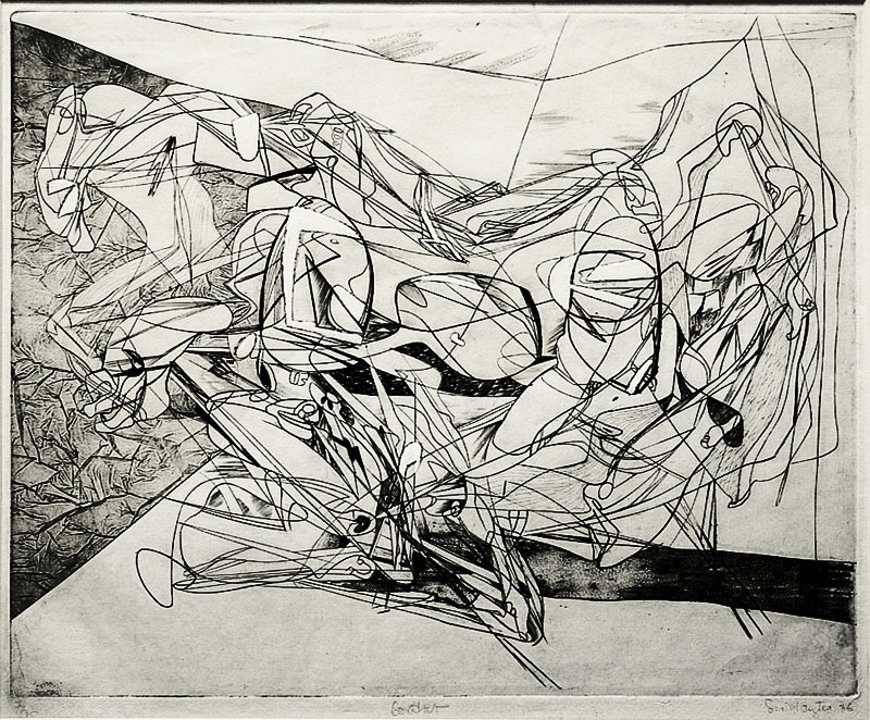
 this image is a wood cutting by Holbien which is how he has portrayed death using printmaking. these particular piece is one of a series of pieces called 'The dance of death'. these were based around the time of the black plague. it appears quite Gothic which was how they viewed death over 100 years ago it was something to be feared of as they didn't have very long life spans back then due to widespread illnesses.
I like the composition of these pieces of work. the areas of dark contrasting with the lighter areas work well as well. I like how the artists has used fine lines to draw out the image as well. http://www.mifami.org/EuroHist/Ass12.htm this is the link to where I got these images from.
 This printmaking piece is from an artist called Alan Campbell. Its called 'Cosmic Death own' this seems to be the artists interpretation of how he views death. and his experiences through life. The skull symbol looks similar to Mexico's candy skulls with its simplicity. The moon that appears in the bottom of the work shows how he relates death to darkness The compass symbols might represent mystery as when we die there is no map telling us where to go or no directions as its a complete mystery as soon as we leave our body.
This is where i got my image from for this artist http://insidetherockposterframe.blogspot.co.uk/2013/10/alan-campbell-cosmic-death-owl-print-on.html


The printmaking on the Left <- is by Joshua Andrew Belanger it portraits death in a very dark was with the high contrasting in black and white tones which make it very bold. the image on the right -> is my way of exploring death in a similar way Joshua Belanger has with black and white contrasting areas. I kept my work non-symbolic and just experiment with layers and the zest to make the negative areas contrasting with the more positive areas. I got the image of the artists work from this site http://insidetherockposterframe.blogspot.co.uk/2013/10/alan-campbell-cosmic-death-owl-print-on.html

 this printmaking by Jessica Helfand on the left <-- looks similar to the zest prints that I have done. although her theme isn't to do with death I looked at her work to see techniques she used as they were similar to mine as u can see. my image of my work is on the right --> I got the artists work from this site http://www.mohawkconnects.com/feltandwire/2010/08/23/jessica-helfand-reflections-on-printmaking/
A quick list of images of artists work that have inspired my own work;


for printmaking the theme is about accumulation and dispersion. I have tied this into my painting theme which is death, body and form. I have done a lot of prints to try to get the effect I want which is building layers on top of layers but still revealing layers beneath. its more of a personal response to the accumulation and dispersion theme. I have made loads of prints based on my feelings towards death its self.
I am using my theme of death in my lino prints. I have used a skull as the centre of the prints and built up only a few simple layers as an experiment into the technique. I liked how my prints have come out and the colours I used which were yellow, red and black. they never turned out perfect as I don't think I sanded down the tile well enough as there we gaps that wouldn't print properly. my 3rd layer smudged in to my 2nd layer as I don't think it was dried properly and I also didn't wipe the carved areas clean very well and left lines on my last layer. even tho I made these mistakes I actually think it turned out good with the white and black lines fading in around the skull area.
From the group crit I learn't that I needed to loose the skull as it was to symbolic and to explore how I can represent the theme death without actually making it obvious. I made some mono prints by using left over ink and sprinkling the orange zest stuff onto it then rolling strait over the patterns that the zest made and rolling it straight on to the page. It gave a very cloudy feel to it with different tones and black blending in with the zest. from the experiment with the left over zest I have produced a lot more prints from this idea but adding some earthy colours to the prints to give an earthy feel to it. these prints that you can see on the left are some of my most successful zest prints. I noticed they have an xray look to them which relate to my theme of death and anatomy. I used darker areas to shroud out the whiter areas to express the mystery that surrounds what we think of death. the one beneath this top left picture i layered up a monochrome theme of black, white and blue. the white area is representing what we think we know about death. Some believe we are born again and others believe we go to places where we meet every one we cared about in our present lives. this print I experimented with colours and used brighter colours and exploring different celebrations and occasions that celebrate death with in different cultures. the hand relates to identity and how we all have our own personal identity that not one other person on this earth has the same as. I looked into Mexico's big celebration called 'day of the dead' where they see death as a celebration of life. Each person celebrates it in their own way, celebrating the person who made and impact on their life. their symbol for this is the candy skull which they decorate with loads of different colours in different ways that related to the person who had died. I chose to use a skull symbol at first, but after the group crit and reviewing what people said it was best to get rid of the skull symbol as its too symbolic with the theme of death and is done by many other artists. So I explored theme of death through identity by using my hands as it is personal to me and no one has the same print and using colours that represent death like dark tones.
 this image is a wood cutting by Holbien which is how he has portrayed death using printmaking. these particular piece is one of a series of pieces called 'The dance of death'. these were based around the time of the black plague. it appears quite Gothic which was how they viewed death over 100 years ago it was something to be feared of as they didn't have very long life spans back then due to widespread illnesses.
I like the composition of these pieces of work. the areas of dark contrasting with the lighter areas work well as well. I like how the artists has used fine lines to draw out the image as well. http://www.mifami.org/EuroHist/Ass12.htm this is the link to where I got these images from.

This is where i got my image from for this artist http://insidetherockposterframe.blogspot.co.uk/2013/10/alan-campbell-cosmic-death-owl-print-on.html

The printmaking on the Left <- is by Joshua Andrew Belanger it portraits death in a very dark was with the high contrasting in black and white tones which make it very bold. the image on the right -> is my way of exploring death in a similar way Joshua Belanger has with black and white contrasting areas. I kept my work non-symbolic and just experiment with layers and the zest to make the negative areas contrasting with the more positive areas. I got the image of the artists work from this site http://insidetherockposterframe.blogspot.co.uk/2013/10/alan-campbell-cosmic-death-owl-print-on.html
 this printmaking by Jessica Helfand on the left <-- looks similar to the zest prints that I have done. although her theme isn't to do with death I looked at her work to see techniques she used as they were similar to mine as u can see. my image of my work is on the right --> I got the artists work from this site http://www.mohawkconnects.com/feltandwire/2010/08/23/jessica-helfand-reflections-on-printmaking/
A quick list of images of artists work that have inspired my own work;

by Holbien
by Whoo Eezeet
by Jessica Helfand
by IVƎEVIL
David Hockney
Robert Rauschenberg
Stanley William Hayter
Norman Ackroyd
I found these artists interesting because of the techniques and (or) the way they portray death in different ways. most of the artist have all used symbolic items in there prints like skeletons which show a clear link to the death theme.
to conclude this terms work is my assessment sheet
formative Assessment
Printmaking
I chose to explore the theme of personal and anatomy before branching of into the theme of death and how it is portrayed in different cultures and which I see it as. I have created some rather dark images contrasting with lighter areas to show a sense of mystery which is how I view death, as a mystery. The prints I have created I used the mono-print technique but with out putting it through the print press. Portraying the theme of death and keeping it non-symbolic was tricky. I also introduced colours into my prints to show influences of how different cultures celebrate death.Artists that influenced my work are; Norman ackroyd, andrew mackenzie, robert Reichenberg, stanley williams hayter, david hockney, Holbien, Alan Campbell, Joshua Andrew Belanger, Jessica Helfand, Whoo Eezeet and‘IVEEVIL’.
Drawing term 1
life drawing
Life Drawing
for the start of drawing we have done life drawing. In life drawing we learnt different techniques to draw the human form and break it down in to its simplest form. After practising these techniques I have learnt how to break down and just see it as shapes, rather than certain objects, like an arm becomes a shape rather than an arm.
Journey project
moving on to more resent work, our new project is called journey and is based on personal journey we go on and represent them into an art form of some kind by creating drawings from this. my journey project started by me going out into different environments and observing different things that stand out in the environment.
I have been out and took pictures of my journey and also produced some observational drawings from my surroundings. I looked into how I can draw these drawings and looked at what stood out in the environment like things that don't exactly blend in very well. I found some buildings that I liked and used some 2 point perspective to draw these buildings as I think it makes them look more bold and shows how they stand out in the environment there placed in.the top left image is a drawing of the building opposite Portland building. I liked the 2 point perspective from this angle and gives the building more impact of standing out in the environment.
I am creating more perspective drawings but within a shorter time limit. I have created some quick observational drawings using just simple line drawings and marker pens to quickly show darker areas and lighter areas in the environment.
I have been looking at some sketch books from when I did art foundation for ideas on what artist to do for my presentation. one which I really liked was Tim Knowles movement drawings ( a piece of his work bellow). I like how he created drawings using things in the environment which links in to my environment drawings. I think the presentation went well but I need to slow down when speaking which I think will happen with enough practice.

After doing my presentation and looking into Tim Knowles work again I think I am going to do some work by creating drawings from movement on journeys I've been on by creating gadgets and devices that track my movement during the during the journey. I have done movement drawings before by sending a parcel to my home address that I have constructed. this drawing on the left is the finished drawing which was masking taped to the box. to get the drawings I created a small box and put 2 pence coins on both side of the small box to give weight to it so it didn't just flip over on its side. I then made a hole in the middle of the box and pushed a doubled ended sharpened pencil so that as the large box was bashed about the small box with the pencil inside drew the movement that it was going along its journey back to its original destination. I have also done vehicle such as car, plane and train drawings. I did these by resting a journal on my knee and holding a pencil in one hand and letting the movement of the vehicle draw out the journey. below are my drawing i have produced using different way of recording movement.


.jpg)
.jpg)
A photo I took of this man and his dog following a train that I laid out as you can see bellow. The man and the dog both stayed with in the lines with out sub consciously knowing that there journey was changed and manipulated and went where I wanted them to go. It may not look like a form of drawing but I am drawing out a path and wanting people to follow it.

Now that I have done my talk on Tim Knowles I have experimented with ways that I can draw movement. I have made a small box and placed a doubled ended pencil through it and masking taped it in place. I have recorded movement by just going on simple journeys to and from town by placing my box in my bag. after gathering a small series of drawings i then recorded movement when I was on a train by placing my phone on my lap and placing my finger on top of the screen and letting the train movement guide my finger on the screen. this created some heart beat style drawings. From these ideas I have used a shoe box and put my double ended pencil in to the shoe box, cling filmed around it to make it water proof and my next idea leaded me to the canal. I placed my shoe box into the canal and let the tide create the drawings.


This image here is a drawing I have done digitally. I have looked in to other ways of creating movement by using sounds. I chose to combine it over the drawing as it is of a singer who creates sounds by singing and the decibels she produces creates movement in waves similar to my movement drawings.


This image is a drawing I have done digitally. this one is to do with recording sound. I have chosen certain images that I have drawn and combined them with the movement drawings. they symbolize the sounds that are created in certain environments that you hear. For example the wolf represents wilderness and nature and I have over lapped the line drawings to represent how sounds might look if they were represented as drawings. The image above this of the singer, she represent sounds we make when we communicate with on and other and see how is varies from sounds that animals and nature make.


Life Drawing
for the start of drawing we have done life drawing. In life drawing we learnt different techniques to draw the human form and break it down in to its simplest form. After practising these techniques I have learnt how to break down and just see it as shapes, rather than certain objects, like an arm becomes a shape rather than an arm.
Journey project
moving on to more resent work, our new project is called journey and is based on personal journey we go on and represent them into an art form of some kind by creating drawings from this. my journey project started by me going out into different environments and observing different things that stand out in the environment.
I have been out and took pictures of my journey and also produced some observational drawings from my surroundings. I looked into how I can draw these drawings and looked at what stood out in the environment like things that don't exactly blend in very well. I found some buildings that I liked and used some 2 point perspective to draw these buildings as I think it makes them look more bold and shows how they stand out in the environment there placed in.the top left image is a drawing of the building opposite Portland building. I liked the 2 point perspective from this angle and gives the building more impact of standing out in the environment.
I am creating more perspective drawings but within a shorter time limit. I have created some quick observational drawings using just simple line drawings and marker pens to quickly show darker areas and lighter areas in the environment.
I have been looking at some sketch books from when I did art foundation for ideas on what artist to do for my presentation. one which I really liked was Tim Knowles movement drawings ( a piece of his work bellow). I like how he created drawings using things in the environment which links in to my environment drawings. I think the presentation went well but I need to slow down when speaking which I think will happen with enough practice.
After doing my presentation and looking into Tim Knowles work again I think I am going to do some work by creating drawings from movement on journeys I've been on by creating gadgets and devices that track my movement during the during the journey. I have done movement drawings before by sending a parcel to my home address that I have constructed. this drawing on the left is the finished drawing which was masking taped to the box. to get the drawings I created a small box and put 2 pence coins on both side of the small box to give weight to it so it didn't just flip over on its side. I then made a hole in the middle of the box and pushed a doubled ended sharpened pencil so that as the large box was bashed about the small box with the pencil inside drew the movement that it was going along its journey back to its original destination. I have also done vehicle such as car, plane and train drawings. I did these by resting a journal on my knee and holding a pencil in one hand and letting the movement of the vehicle draw out the journey. below are my drawing i have produced using different way of recording movement.
A photo I took of this man and his dog following a train that I laid out as you can see bellow. The man and the dog both stayed with in the lines with out sub consciously knowing that there journey was changed and manipulated and went where I wanted them to go. It may not look like a form of drawing but I am drawing out a path and wanting people to follow it.
Now that I have done my talk on Tim Knowles I have experimented with ways that I can draw movement. I have made a small box and placed a doubled ended pencil through it and masking taped it in place. I have recorded movement by just going on simple journeys to and from town by placing my box in my bag. after gathering a small series of drawings i then recorded movement when I was on a train by placing my phone on my lap and placing my finger on top of the screen and letting the train movement guide my finger on the screen. this created some heart beat style drawings. From these ideas I have used a shoe box and put my double ended pencil in to the shoe box, cling filmed around it to make it water proof and my next idea leaded me to the canal. I placed my shoe box into the canal and let the tide create the drawings.
This image here is a drawing I have done digitally. I have looked in to other ways of creating movement by using sounds. I chose to combine it over the drawing as it is of a singer who creates sounds by singing and the decibels she produces creates movement in waves similar to my movement drawings.
This image is a drawing I have done digitally. this one is to do with recording sound. I have chosen certain images that I have drawn and combined them with the movement drawings. they symbolize the sounds that are created in certain environments that you hear. For example the wolf represents wilderness and nature and I have over lapped the line drawings to represent how sounds might look if they were represented as drawings. The image above this of the singer, she represent sounds we make when we communicate with on and other and see how is varies from sounds that animals and nature make.
For me to improve on this idea and take it further I can look into ways of recording different sounds in different environments and getting these sounds to convert into lines that represent the sound made. The image above which is another drawing I have done digitally. these lines are to represent the sounds that are produced from a TV. The person is from the film 'Iron man' which I chose to represent the TV sound movement as he is an actor of TV.
This is another drawing I have done and blended it with movement lines. Like the one above its movement that is represented with sound to produce lines that I have blended with the actor of the Movies on TV. I have also added the original drawing with out the added line movement drawings.
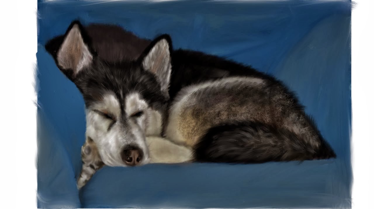
This drawing I have done of my dog is a combination of sound and physical movement. It represents the noises that animals make. It also marks the end of my train journey and what I looked forward to seeing at the end of it, which was my dog. the lines where made while I was on my train back home for the Christmas holidays. To create these drawing/ paintings I used my touch screen laptop and the software I used was Adobe Sketchbook Pro. They started of as drawings but I developed then further trying to get them realistic.


Subscribe to:
Comments (Atom)