for painting a theme that I am going with is identity, person, body, form and death. my starting point is to explore ways of using colour and marks with in my theme. I have looked at skulls and the way people view them as negative. I started off by taking some photos of a skeleton and taking photos from different angles. By taking photos from underneath the skeleton looking up at its skull it gives a very domineering view.
when people think of death straight away people assume Gothic, churches, darkness and sadness but I wanted to explore a different way of presenting death. I am experimenting with different colours like blues and oranges that contrast each other nicely rather than just black and white. I have chose to paint skulls because the skull is the main source of our lives which holds our brains and its our brains that allow us to fear death and view it in negative ways.
I have researched into other cultures that celebrate death and one that struck me first is the Mexican celebration 'the day of the dead'. they see it as a chance to celebrate past lives and do so with loads of bright colours and people having a happy time. when we celebrate someones death we view it more as a sad day and fear for where they have gone and what will happen to us next.
after a group crit I learn't that people viewing my work liked the mark making that I have done to show the textures of certain areas on my skull paintings. they also think I should add more skulls into my painting to see how it looks. I also need to experiment with more colours and try larger paintings. I should also look at focusing on different parts of the body to see how that turns out. I also found out about a large amount of artists mentioned in the crit that I have taken note of.

this painting I have focused on a skull and used blue and green colours to show different shadows where the light would hit the skull and cast shadows in certain areas. I used orange to contrast with the blue and yellow to contrast with the hints of purple that I painted in there.

this painting I was focusing on the marks and created layers with the paint. I used a stick and my fingers to get a jaged look and as the end of the skull had a rougher look like round the end of the nose area compared to the smoother parts so I used my finger to paint the smoother looking areas.

This one is also a similar study to the one above where I focused on different compositions and experimenting with different colours to create different shadows and lighter areas. I used a stick for the rough areas agian and my finger for the smoother areas.
artist research - Vincent Van Goph

this image of Van Gophs painting is similar to my skull painting as i am looking at recreating the shadows using colours. I like how hes used thick brush strokes to define areas and smother smaller ones in other areas. it also has a creepy feel to it and a message to people who smoke that they will die earlier and have health problems to come.
Demien Hurst - Platinum skull

all though i'm not so sure about what to think of this piece of work as it seems pointless from what I've read of his reviews, It still has a deathly feel to it and it's another way of looking at death. im not sure if this is a real skull which he has work straight on to as it doesn't say clearly in his reviews if it is or not, but I think it might be a cast of some ones skull who has died and now has diamonds stuck to their skull for some strange reason. The message that i get from this skull is what us humans desire the most from life, which is wealth.

This is another one of Demien Hurst's pieces of work which is a painting of a skull. The composition of this is very striking the way he's painting it looking straight forward. this also has a digitally painted feel to it. The dark background complements the painting and makes it appear more striking as I don't think it would of been so striking if it was against a white back ground.
hand made skull

all though this isn't a painting I like how creepy this looks and how old it appears to be. The markings look like some witch craft symbols or something similar. from doing some research this skull was made for a TV series in America.
oil painting by MegLyman

this painting I found on a website called DeviantArt. I liked the heavy brush strokes and use of orange and blue tones instead of black and white that people tend to use when painting a skull. the yellow areas appear soft compared to the darker blue areas that appear sharper and edged.
My work

these paintings that I have done are quick paintings using colours and tones that are represented within death in certain cultures. the one above is more of a Gothic approach or British one as we dress in black when we attend a funeral and its seen as quite a dark and sad time.

this one is a more brighter study as the culture I was looking into was Mexico as there famous for there brightly coloured death celebration of the 'day of the dead', where death is seen as a celebration of life and passing for those who have passed away.

this is another study on colours that are prominent in Mexico's day of the dead celebration. there are no black or dark colours present in there clothes they wear to celebrate.

this one is a mixture of our view on death as dark and Mexico's brightly coloured festival appearing through. this has gave an idea for what to paint on the canvas that I made of a mixture of our views on death over theirs.

as I previously talked about painting a mixture of our views of death combined with Mexico's and this is what I painted as a result. on the left is the darker thoughts behind death with Mexico's brighter thoughts flooding over and fighting against the darker views.

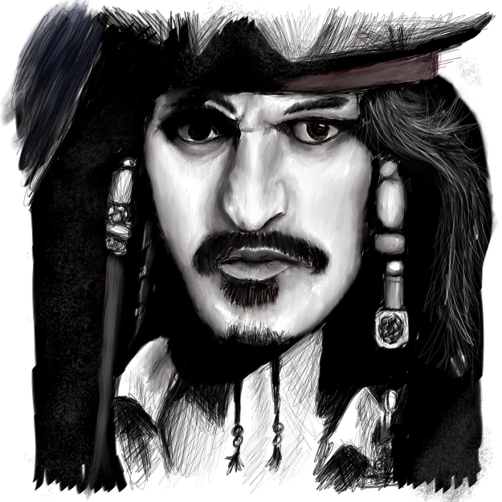
So from painting skulls as it seemed easier than actual faces and experimenting with tones colours and textures I thought I would try portraits of faces and try painting tones and textures of actual faces. This one above is of a film advertisement I saw in the train station so thought I would try painting it why waiting for the train. The above image took over 9 hours for me to paint and I used Auto Desks - SketchBook pro 6 to paint with. From painting this you can see his identity and notice who he is and what he looks like where as with the skulls there identity is a mystery just like the theme of death its self. when you die you kind of loose your identity and become nothing but a skull and memory to those who remember us.
This one is a darker toned drawing to go with the gothic theme and is another iconic person who has a very well known identity ( to those who watch action films).

this is another iconic person I have painted. by looking at each individual you can see difference between each one of them like the first person (iron man) has a very broad jaw and the woman (Niki Minag) has a slim narrow jaw line. its shows how every ones skull vary's and with the flesh and hair on the skull shows this out more than just looking at the skull by its self. This image is one of my second digital painting I have ever done and you can tell this as the textures are quite harsh and not very skin like and the subject I was painting had very smooth skin ( as I believe the image I was painting from which was off an advertisement was already Photshoped and artificial)

this is a painting I have done of my dog. I wanted to try painting different texture to create a fur looking texture. this one was the most difficult out of the previous painting as trying to get his fur realistic was hard and took me 2 days to paint this about 20 hours where as the other three took about 9 hours to paint. this was also my first go at digital painting as I had a new laptop with touch screen and no physical paints to paint with, due to lack of money. The point to my paintings isn't really "photorealism painting" its more of trying to trick the viewer into thinking that they are viewing a photograph but I have flaws in there so u can see after closer inspection that it is in fact a painting that I have done. because I have done it digitally people wonder and ask how have I done it as it doesn't appear to be a traditionally hand painted painting using physical paint mediums. as u can see on the above painting I have left smudges around the outside of the image and only focused on the dog as the main detailed subject. playing with and trying to create different textures using a digital soft ware to get the painting effects I want was a challenge and did take me a few good hours to get the textures to look the way I wanted them to.

this is a wolf drawing that I have painted as yet again I wanted to experiment with textures and colours. From doing these digital painting I found them more difficult that traditional painting but a less messy alternative. These paintings have helped me to understand precision and that getting the basic outline correct affects the whole painting. if it has an off composition or doesn't look proportioned properly then the overall image seems incorrect so getting the perspective of the painting right I found was curtail. then after getting the perspective right I them started practicing with the software to create the different tones and textures to make the image seem believable. I have leant so far that if the outline and perspective is not right and I continue to paint over it to try make it appear more believable it is still not correct and ruins the whole painting making it a waste of time.
No comments:
Post a Comment